For my emojis, I decided to experiment with three different categories (food, face, and building) all relating to Jordan. Listening to the 99% Invisible Podcast gave me some insight on how to approach this process. Initially, I was going to illustrate niche topics and Jordanian inside jokes, but I realized the importance of universality in the creation of emojis, even if their themes belong to a specific culture. I do not expect everyone to know what the emojis represent, but I aimed to at least make them universal within the defined domain of Jordan, its surrounding areas, and to people who have heard a thing or two about the country.

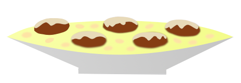
Mansaf – the national dish of Jordan. Everyone has seen it, and most people fall in love with it. The main ingredients include rice, lamb, and jameed (yogurt). This simple but delicious dish is served in special occasions and celebrations in large trays, allowing groups of people to stand around it and eat together (traditionally with their hands). For the emoji, I wanted to emphasize the tray, and give the ingredients their characteristic colors for ease of identification. Admittedly, my lack of talent made it difficult to make the emoji look as appetizing as its real-life counterpart, so I sprinkled almonds on the rice to make it more appealing.

Jordanian Man with Shmagh – a symbol of the country and its traditions. It was vital to get the red and white pattern right, as well as the top piece (‘gal).
I tried to make it look as close to the current set of face emojis as possible, for consistency’s sake. I had a hard time deciding on one expression to represent the population, so I left the face with a blank look so that any expression can be added later.

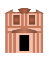
Petra – one of the wonders of the world. I decided to go for the most recognizable construction in Petra, the treasury. I tried to imitate the general positioning of its features (columns, walls, doors, etc) without sacrificing the simple emoji-like look. I also made sure to get as close a color scheme as possible to the real thing. Despite that, I found it difficult to create an easily recognizable treasury, and looking up icons on Google made it clear that a more stylized approach could fix that problem.
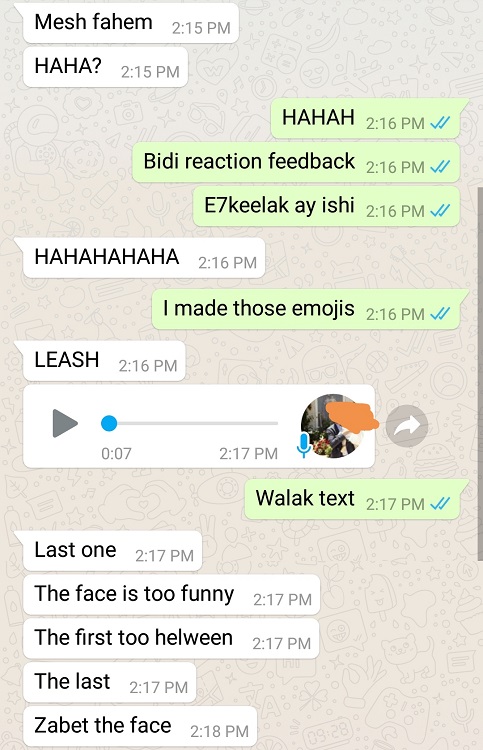
I sent the emojis to two friends with the caption “missing Jo” (which confused them), so I had to explain that this was part of a class and wanted feedback. Apart from some hesitation with the Petra one, they easily identified the emojis. I wasn’t sure whether the face emoji gave context that these things were Jordan-related, making them easier to identify. In retrospect, I should have sent the Mansaf/Petra emojis before the face to make sure that they’re separately identifiable. One friend mentioned that there’s too much going on in the Mansaf emoji. The other friend mentioned that the “face is too funny” and suggested that I should fix it. For version 2, I set out to add an expression to the face, simplify the Mansaf, and make the Treasury more easily recognizable.

For the second version responses, I sent the emojis without context to two different friends and asked them to identify what they represent. They easily identified all three emojis and mentioned that they generally liked them, but were more critical towards specifics that could be further improved in a third iteration. The most pressing change would be to the Mansaf emoji, since both friends mentioned the fact that the lamb looks like donuts.
As for the process itself, I used GIMP 2.10 to draw all emojis. I used path/selection tools to create general shapes, followed by fill/gradient/bordering/shrinking tools to add details. For color selection, I downloaded online images and used the Eyedropper tool to obtain the correct RGBs.
All in all, I learned how much goes into the process of coming up with proper illustrations to represent things in an identifiable way, specially with food and buildings. This was despite working on unambiguous things, as opposed to emojis that have vaguer/global applications. As a person who uses a grand total of 2 emojis (as seen in my chats below) and doesn’t really understand their overall appeal, I at least appreciate the intent of this method of communication now that I got to create a few of them.


