Category: Uncategorized

Theo’s ideas for Paper #1

First, I would like to briefly explain what communication technology signifies to me in the context of this assignment. Although in general I subscribe to the idea of Technological Determinism as a view of technology driving the development of society, for the purpose of this assignment (and eventually my paper) I find that definition of technology limiting. Hence, I looked at technology as any means of progress by any tool that is present in the daily lives of people that helps them achieve a task, namely the propagation of an idea/message through a medium – “communication”.

Idea 1: Cyrillic Alphabet, invented around 940 in First Bulgarian Empire
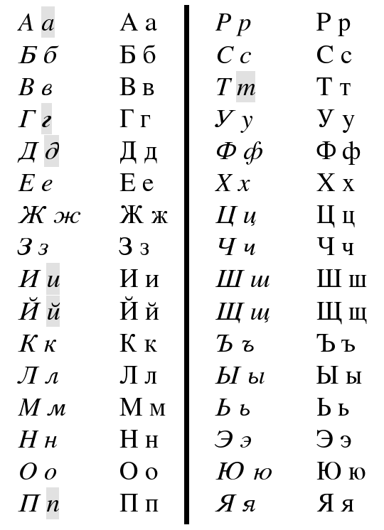
The first thing that came to mind when thinking about pre-modern communication methods and technologies emerging in Bulgaria was the most obvious and omnipresent part of the national identity – the language and its alphabet. The Bulgarian language has been written down in Cyrillic script since the 10th century, shortly after The Cyrillic script was created at the Preslav Literary School, derived from the Greek uncial script letters, augmented by ligatures and consonants from the older Glagolitic alphabet for sounds not found in Greek. Cyrillic was formalized either by Saints Cyril and Methodius or by their disciples in the late 890s. The purpose behind the creation of a new script was primarily for religious purposes, as the Church was the driving force behind education, art, and science at that time. The Cyrillic script was more suitable for church books as it better captured the sounds of verbs and nouns in the Bulgarian language, which did not exist in Greek and could not be captured using the Greek alphabet or the Glagolitic alphabet. 

The emerge of the Cyrillic script had a profound effect on the Bulgarian history and arguably on the existence of the nation in present day. The Cyrillic alphabet was used to write down pieces of the Bulgarian folklore and tradition that were hitherto transmitted either verbally or written down using foreign languages and/or the script of foreign languages. Having an alphabet that directly related to the national language strengthened the sense of a nation and protected the culture from foreign influences. The crux of its importance was during the period when Bulgarian territories were under Ottoman Empire rule, when a foreign culture, religion, and language were forced on the local population, which was grappling for a hold of its own identity, religion, and tradition. The Cyrillic script helped the effective (and permanent) communication of all those nation-defining aspects from one region to another, and from one generation to another. Last but not least, the Cyrillic is the basis of alphabets used in many of the languages with Orthodox Slavic origin, and non-Slavic languages influenced by Russian as well. As of 2011, around 252 million people in Eurasia use it as the official alphabet for their national languages, according to population data sources on Wikipedia. 

Idea 2: Canon gun fire as communication signals in 19thcentury Bulgaria

Language and script are one of the foundational means of communication, that in fact differentiate man from the rest of the animal kingdom. One of the premises of verbal communication is that it is universal, or at least understood by multiple parties with a certain level of precision and unambiguity. There are situations in life, however, that necessitate the ability to transmit a message from one party to another with a level of secrecy that protects the meaning of the message from becoming known to parties for whom it was not intended. This concept has been critical historically in transmitting messages during wars and is equally important in the present day with issues of privacy and secrecy of data in the digital era. However, the ability to send messages that convey meaning only to an intended audience was key in the April Uprising in Bulgaria in 1876. One way to do so was through auditory signals, namely the sound of canon gun firing. 

To understand the importance of canon guns in Bulgarian culture and history, one must understand the cultural and geographic circumstances around it. The geography of Bulgaria is dominated by mountains and forests. This fact was used as an advantage to rebellion groups and defense groups during the uprisings against Ottoman occupation. In simple terms, the ancient trees in the forests provided material for making canons easily, while the mountain ranges provided acoustic environment in which sound propagated far and loud. Hence, a canon gun fire became a viable method for relaying a message across villages and among different rebellion groups hiding in the forests. There were a set of parameters that were mutually agreed upon prior to such a communication. For example, the number of fires could have a meaning, or the time of the day (hour and minute) could indicated different things. 

The practice of firing canon guns as communication method became prevalent and iconic for that period of Bulgarian history, so much that it became a premise for one of the most famous Bulgarian novels – “Under the Yoke” by Ivan Vazov, as well as part of many traditional celebrations in Bulgarian culture nowadays, such as weddings and marches. 

Deep Dive Lesson – Cristina, Keith, Lauren, Raitis

  • What you did?

We provided an introduction into digital advertisement to our fellow classmates. We tried to divide 75 minutes into 2 main sections: theory and practice. During the theoretical part, we talked about why advertising is a big topic in the modern day communicational technologies, what are the forecasts, how big companies are using it, as well as what are some of the potential risks related to our data being processed by third parties. The practical part included quick sessions on ads on Facebook and Google, as well as a quick review of two ads we posted earlier on both platforms and their data analysis tools – Facebook Analytics and Google Analytics. There are more platforms that enable digital advertisement, but based on our deep divide these two platforms seemed to have wider reach as well as a larger user base.

  • Why you did it?

The topic was suggested to us by the professor and after some discussions we understood that ads are, in fact, an intriguing mode of communication. Why? Rarely we think how much thought goes into the ads by the sender and even less frequently we think about how much we influence the ads we see ourselves. That is, we might think of ads as a one-directional mode of communication with no back-and-forth feedback loops, that actually exist on every website. Therefore, we wanted to share how much deliberate decisions and details go into selecting a target audience, how these ads that are so abundant can promote goods as well as ideas and how every user sees ads that are based on their actions on the Web.

  • What the goals were?

Our foremost goal was to inform people about how ad works and tell them about the backend of digital advertising. We wanted to show them exactly what the advertisers will be seeing when they put their ads up by introducing them to Google Ads and Google Analytics. To do this, we put up our own ad for our Comm & Tech website and invited the class to participate by going on the page with their phones/laptops. This allowed us to see all the data that was being collected realtime and indicate what information we would be giving everytime we were accessing an ad. Aside from this, we also presented several other platforms/tools to examine how we are targeted in ads and what data we’re giving out, such as Facebook and Google Tag Assistant. Overall, with all this information in mind, we wanted people to actively think about how they’re contributing to, and taking part in, digital advertising and some questions this entails, such as ethics and privacy issues.

  • How it went?

As the first group doing the Deep Dive Lesson, we were a bit unsure about what to expect. During our initial discussions, we concluded rather quickly that we wanted to do a lesson on digital advertising. We faced mainly two concerns: 1. We wanted to make sure our session was interactive, and 2. We needed to make sure we didn’t run out of time. We addressed these two concerns by adding several discussion topics and interactive elements, and allocating a set amount of time for each topic. On the day, the session went really well – the class was engaged throughout, and several people became more aware about digital advertising.

References

  • Analytics: https://analytics.google.com/analytics/web/?utm_source=demoaccount&utm_medium=demoaccount&utm_campaign=demoaccount#/report/visitors-overview/a54516992w87479473p92320289/
  • More about the recent AD activity – here.
  • More about Facebook ads categories –  here.
  • More about Google ads categories – here.

Life in AD – Emojis

After listening to the 99% Invisible Podcast’s “Person in Lotus Position”, I decided to create emojis that would succinctly describe aspects of my life growing up in Abu Dhabi.

After listening to 99% Invisible Podcast’s “Person in Lotus Position”, I created emojis that reminded me of Abu Dhabi in ways that were both memorable and funny. I initially tried to design some emojis with applications on the iPhone App Store, but I realized that they were too restricting. Deciding to switch to a graphic design application, I chose Pixelmator on Mac to design the emojis. I also severely underestimated the time needed to create the designs, although I did learn a lot about graphic design in the process.

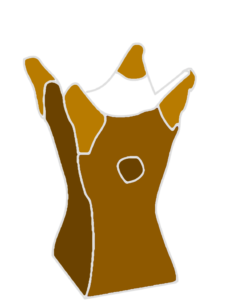
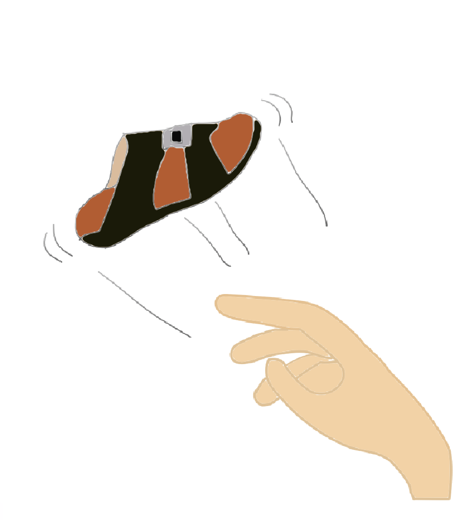
I created three emojis: One of a landmark that reminded me of home (Aldar HQ), one of an important part of Emirati culture (Bukhoor), and one for comedic purposes (Emirati sandal (na3al) being thrown out of a hand).

Emoji #1


I used the Aldar HQ building as a basis for an emoji representing Home, as it was the building I passed every day on the way to school. When I showed the emoji to my parents, they immediately recognized it, and said that they found the design to be very pleasing. Out of the three emojis, I feel like this one is the most similar stylistically to Apple’s current emojis, while the next two have more unconventional designs.

Emoji #2:


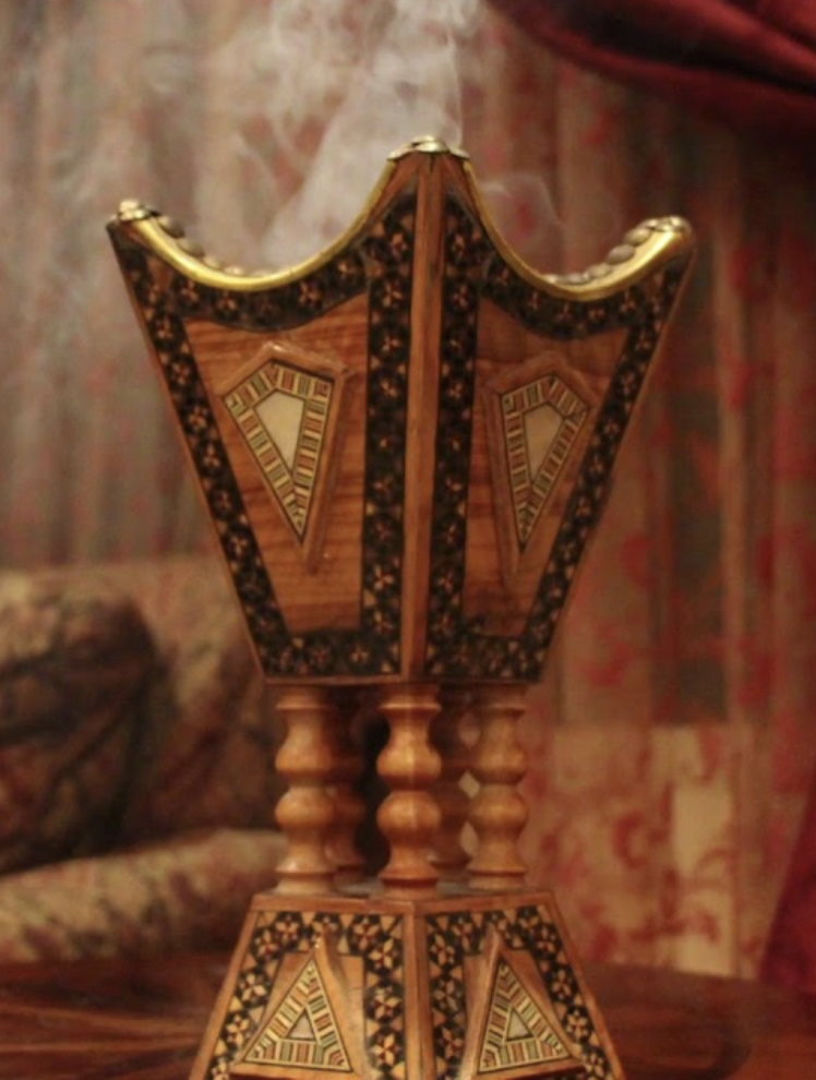
Bukhoor is the name given to small pieces of Oud that are burned to create a pleasant aroma in the house. My mom would always light bukhoor when I got home from school and walk with it around the house to spread the long lasting smell. She also used it whenever we had guests as a sign of hospitality.

If you’ve never seen bukhoor before, then it is pretty difficult to understand what the emoji is trying to signify. A few relatives I showed it to said that they recognized what it meant, but that they doubt it could be universally used.

Emoji #3:


With this one, I depicted an Emirati sandal, or “na3aal”, being thrown out of a hand. A common parenting technique in the Arab world, the action depicted in the emoji should resonate with people who grew up in the region.

After showing this emoji to a few friends in the library, they asked if I could send them the picture so that they could use it as an emoji as well, which was pretty cool. My parents also found it very amusing.

Many times before, I’ve felt like a text message could have been just that tiny bit better if only there was a perfect emoji to go with it. #3 is my favorite because the emoji itself allows for the expression of a situation that was much more difficult before.


Flavs & Her Paraguayan Emojis

For this week’s assignment we were asked to create three emojis from our hometown and ask for feedback from our friends and family. I took my time to draw them out and then pass them on to Illustrator in order to refresh myself on how to use the tool. Once I was done, I decided to share it in a group chat of close friends, on a one on one conversation with a friend who’s also a graphic designer, and with my parents and directly ask for their feedback. Most of the feedback was done through voice notes so it wouldn’t really make sense to post them. With all three groups, I received a similar response for each. In the following paragraphs, I’ll describe the context each emoji and give their respective reactions. 


Mongarú: 

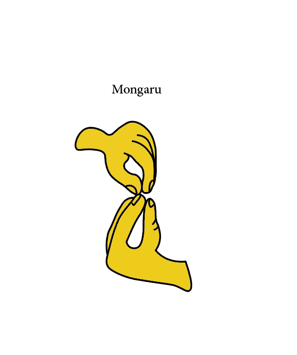
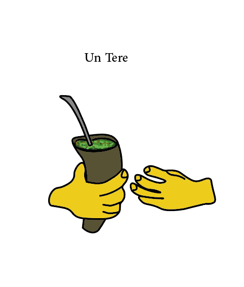
Mongarú is a word in Guarani (the native language of Paraguay) that literally translates to “feed”. However, as most of the words in Guaraní, it’s social connotation is completely different. This emoji describes the action of the mongaru, which goes as follows: When someone is telling a friend of an achievement they’ve recently had, the friend would say something along the lines of “come here” and would put his hand in the shape of the top hand with an up and down motion of the wrist. This is an invitation for the person telling the story to put his hand as shown in the bottom hand in the emoji. Put together, they are supposed to create the shape of a bird feeding its babies, hence the literal term. Nevertheless, it is an official demonstration of congratulations that is demonstrated through physical action. I chose to draw this emoji because I don’t think I use any for congratulation purposes. I understand that there are a lot of celebration bells and bows, but that is not how we express congratulations in a daily context. I felt that doing it through Mongarú would go along the common use of hand gestures in emojis. 

My friends however stated  that these two hand gestures could be done in two separate emojis, since they are actions from a sender and a receiver. In it’s current state, the sender is already taking the action of the receiver. If they were to be split, the sender’s emoji would connote the same intentions as the live action, an invitation to come forward and send the bottom emoji. This action would have a context of connection. Nevertheless, there is a problem when taking perspective in consideration. Senders and receivers don’t share the same perspective when texting. Senders normally see their own bubble appear coming in from the right of the screen, while receivers see the senders message coming in from the left of the screen. This would distortion the perception of the images, because both wouldn’t be able to meet and create the shape. The only way to fix this change in perspective is for Unicode to automatically reflect the perception so there would be a “bird-feeding” image for both the sender and the receiver.


Un Tere: 

Some of you will understand that tereré is the colder (and better) version of the Argentinian Mate, a sort of unique herbal tea. However, the context of tereré is very particular in Paraguay. People are constantly getting together for breaks and hangouts to sit in a circle and pass around the tereré. Therefore, this invitation would also be an invitation to hangout and drink some tereré. It would be used for people who are too lazy to ask someone to hangout and would instead just send them this emoji. In the context of Paraguay, this action would be very self explanatory, which therefore means that people would understand right away that this was an invitation to hang out. This then means that it fits the enclosed context of “universality” stated in both “The Jump for Universality” and “Person in Lotus Position”. As the 99% invisible podcast recommends, it is also not a trend, since it is a traditional event that has been happening for centuries in the country. Given these two reasons, I believe I could actually make a very arguable case in the hypothetical Unicode Paraguayan Emojis Competition.

There were no recommendations for change in this emoji, most of my friends told me that this was their favorite one since they say “Who’s up for a tereré” on a daily basis, so I therefore decided to keep it as it is (despite the design criticism of “the herbs look like avocado” and “the hand looks like feet”). 

Sombrerito Piri – “Que Paraguay” 

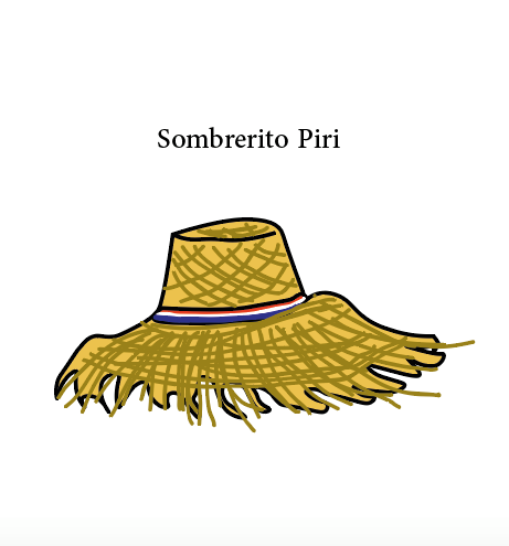
This last emoji caused most of my reflection on the whole culture and thought process that goes behind emojis. I did all of them and sent them for feedback, and only then did I do the readings and hear the podcast. It was very interesting to see how a lot of the feedback I got resonated with what was being discussed in both assignments. As you can see, what I have here is a Paraguayan   hat, mostly known as Sombrero Piri. When I sent it to my designer friend, his first reaction was “I love the first one and the second one, but the third one doesn’t have a clear meaning. It looks like you just did it to complete the task”. I must admit, I did have a lot of trouble coming up with a third emoji. With all of the previous emojis, I had a clear idea of the interactions I wanted to portray. However, for my last emoji I wanted to encompass a common phrase we use Que Paraguay, that is SO Paraguay. When I explained this to my friend, he was more understanding of what I wanted to portray. We took a while to think about when we would use this emoji and he finally came up with the situation: “Hey dude, my car window just shattered because a mango fell on it”, and then he would send the Que Paraguay emoji. My parents had a similar reaction to the one of my friend, at the beginning they didn’t really know what to make of the emoji. It was not similar to the previous two, which were clear actions that we see at a daily basis. In David Deutsch’s  essay “The Jump to Universality”, he mentions that changing the phonetic representation of the word “treason” to a symbol of its own would be tedious. Whenever you are embodying a specific term to a symbol and want to use that symbol to communicate, he said “one would somehow have to inform all intended readers of the meaning”. The same thing applies to my Sombrero Piri, it has a symbolical meaning rather than the action meanings found in my previous emojis. This therefore makes it harder for people to interpret it without asking “What does it mean” or “when would I use it”. 

The Emoji Challenge

These are the three original emojis that I created with Illustrator:

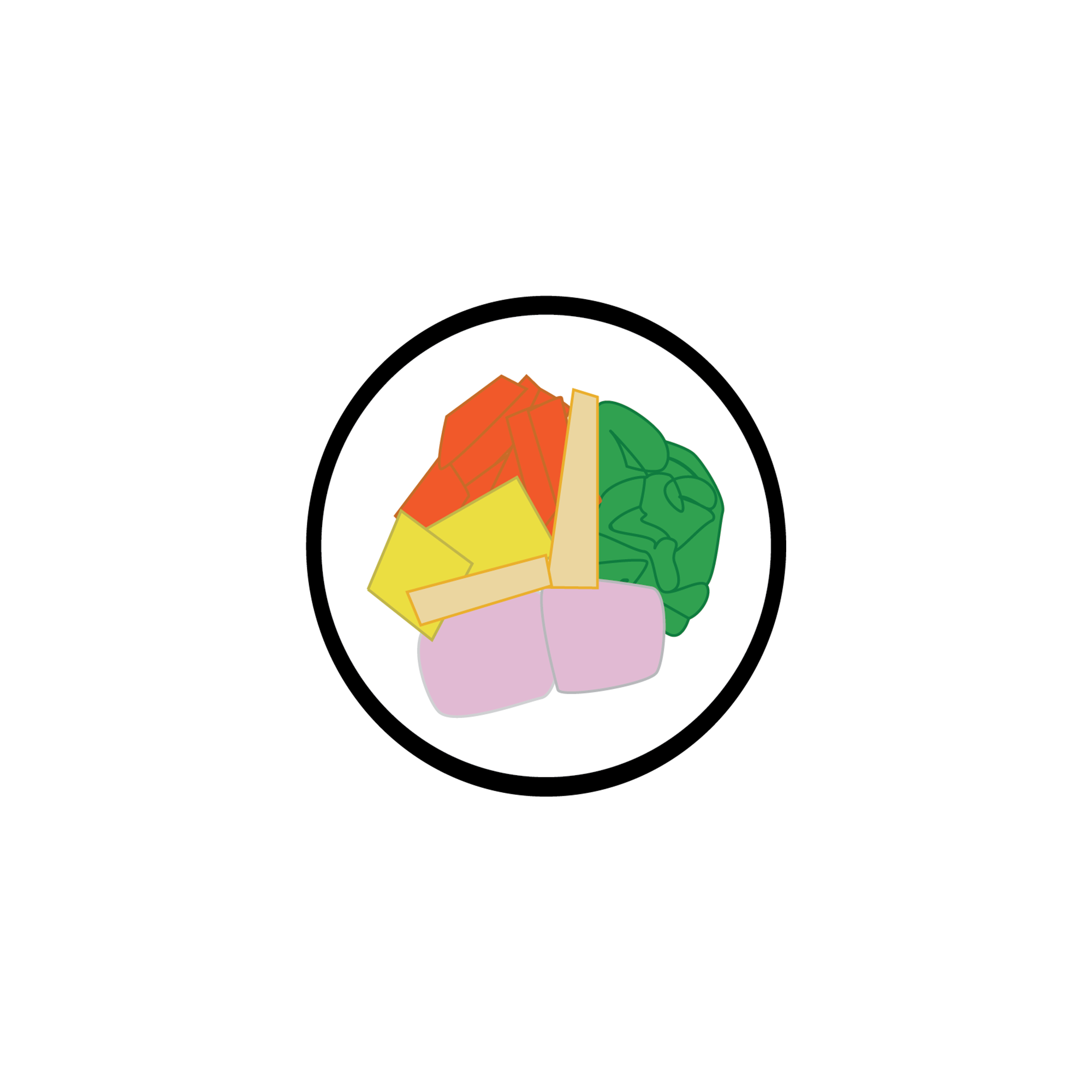
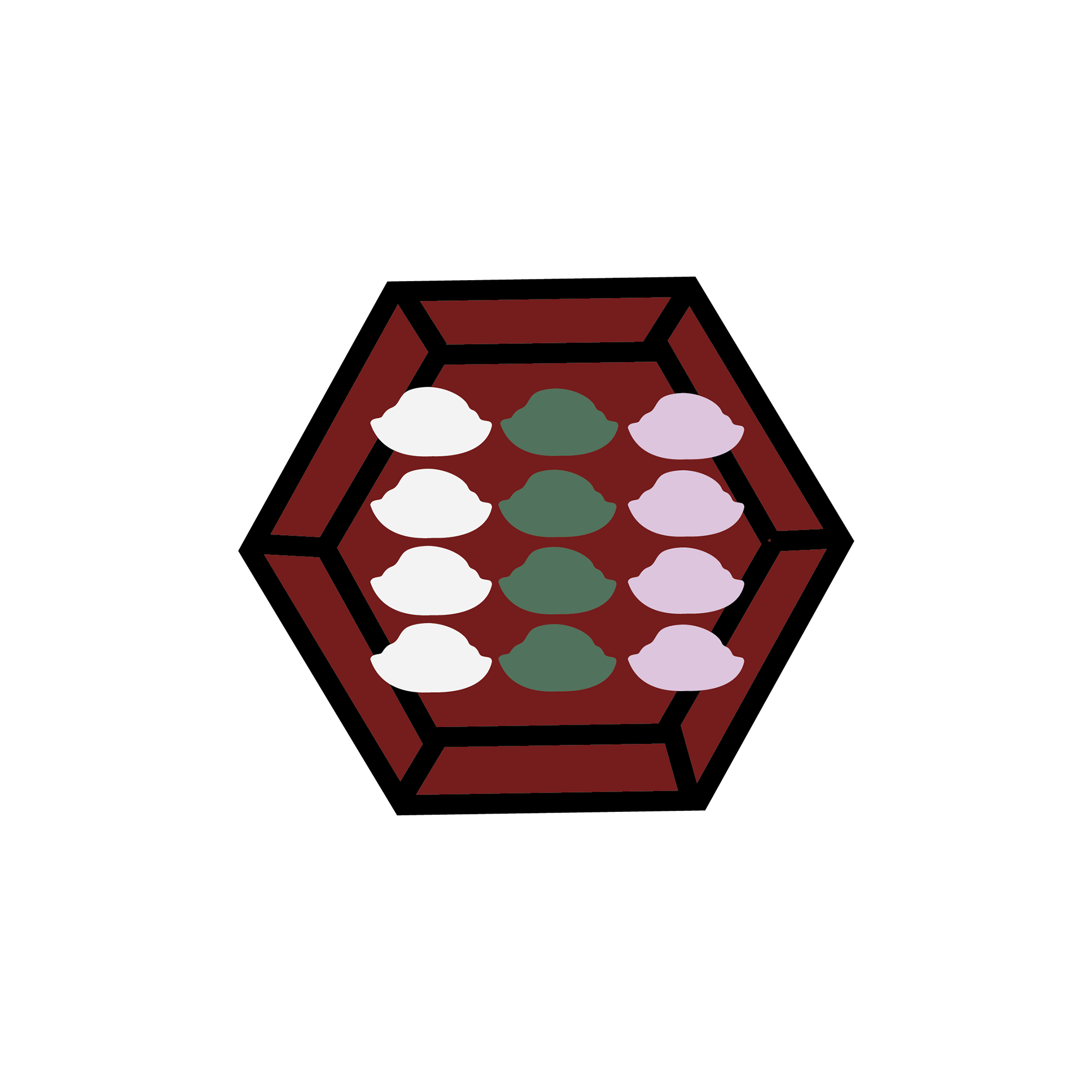
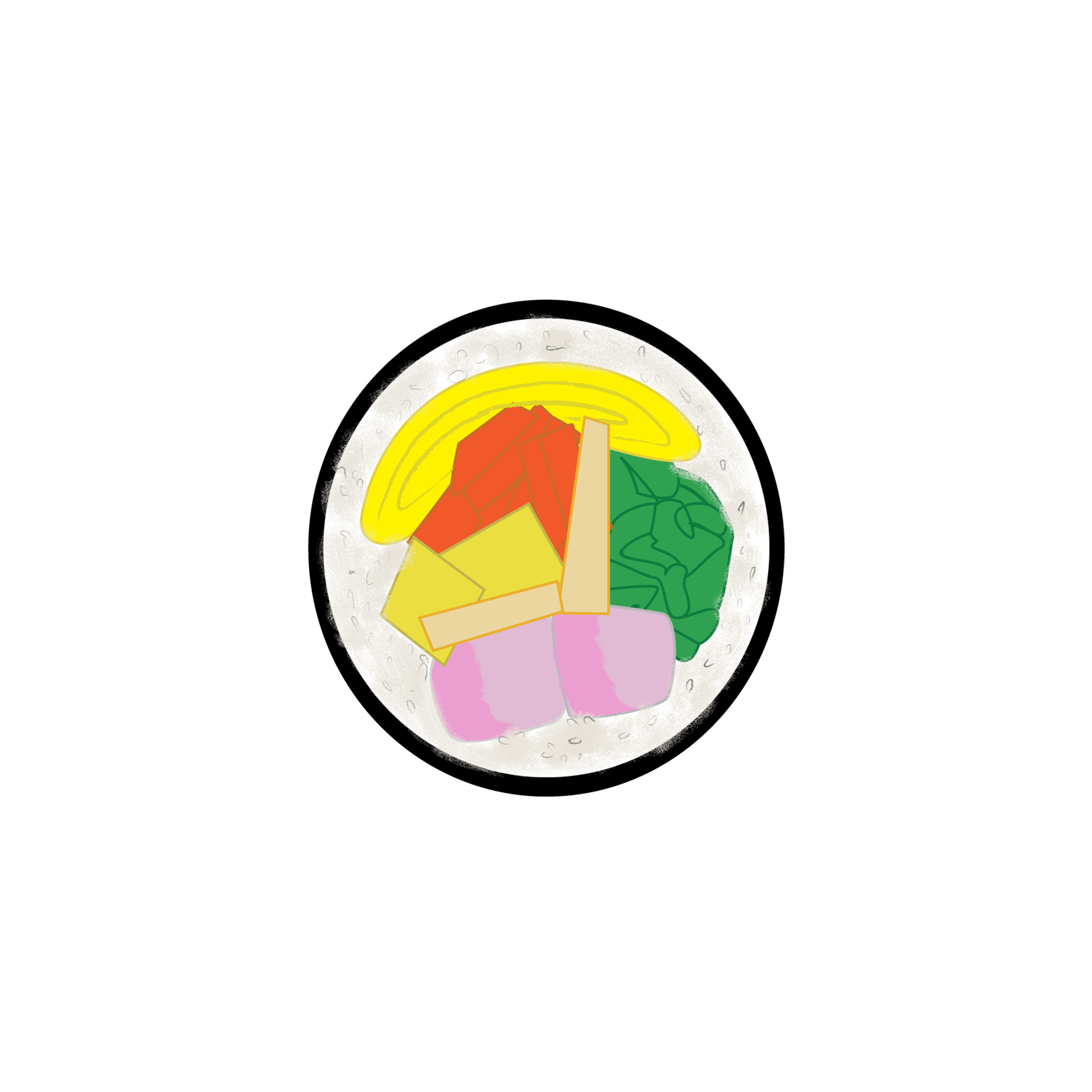
The first one is kimbap, an equivalent to a Korean sushi roll. The second one is steel chopsticks, which all Koreans use to eat their meals. The third one is called songpyeon, which is a traditional Korean food made of glutinous rice.

When I was making these emojis, I think I was subconsciously aware of the Korean autumn harvest festival that was right around the corner. On this day, Koreans usually gather with their families and relatives to eat good food, including the songpyeon. But this is a good (and very accurate) thing cause Koreans are obsessed with food. We love food – we love making them and even watch people eat them (this is actually a very profitable market in the country).

When I sent these three emojis to my Korean friends and asked them what they thought, they all replied that these reminded them of the festival and of eating. I asked them if the emoticons were easily recognizable, to which most replied yes except for the kimbap. I asked for feedback and one replied that the white part didn’t look too much like rice.

When I asked them if they would use the emojis on a daily basis, one of them replied, “I’d use the chopsticks but don’t know about the others.” I found this comment very interesting so I asked her why, to which she said she just wasn’t sure when to use them and would want some words to guide her. When I asked her on what occasion she would use the chopsticks emoji, she replied, “I’d message my friends saying ‘let’s go it!!’ and add the chopsticks. The others aren’t that straightforward to use.” I found this information to be very valuable as this is an issue specific to Koreans — we almost always have some kind of words on top of, or around, an emoji. We think a simple phrase add to an emoji much more and interesting. For Koreans, more information is better. (Hence why Google is unpopular in Korea, where Naver, as its main search engine, populates its website with lots of information, unlike Google’s single search bar. Check it out!: www.naver.com)

After this feedback, I made some adjustments to two of the emojis:

I added more texture and shade to both emojis, using Photoshop. I also put in a long piece of rolled omelet inside kimbap as it’s one of the main ingredients (how could I have forgotten!). I even included a short text that says “wanna eat?” in formal/playful Korean for the songpyeon emoji.

When I sent these two emojis, along with the chopsticks, to two more Korean friends, I was surprised by how both friends liked songpyeon most. They said this emoji is particularly cute and they liked the words on top. I think the phrase definitely contributed a lot to its popularity as it took into consideration what Korean emoji consumers were looking for. 

Emojis for Chisinau

I am originally from Glodeni, a pretty small town in the North of Moldova, currently its population is about 5000 people, maybe less. Because I only spent there full 6 years, in this assignment I will focus on Chișinău, the capital of Moldova, where I have been living for the past 16 years. Chisinau is a pretty small capital with its population under 1 million and it is the only relatively big city in the country. My assumption is that none of you will travel to Chișinău in the near future. BUT IF YOU WERE TO TRAVEL TO Chișinău IN THE NEAR FUTURE, below are three emojis that will help you learn a think or two about Chișinău prior to your potential visit.

What do my emojis mean and why are they related to Chisinau

Babushka

In Russian, babushka means grandma. While there are already emojis depicting older women, supposedly grandmas, there are no babushkas and I would argue that the two are different. A babushka, in a colloquial sense, is not only defined as an older woman that has children whose children have children. In a broader sense, it depicts a woman – born and educated during the soviet times, that found new meanings in Orthodoxy following the collapse of the USSR. Babushkas are lovely and sweet and their scarfs represent their humbleness. Among other responsibilities and skills, babushkas are able to cook 7 meals with only two potatoes, are really unhappy with the ways in which teens behave, have strong political opinions, and are involved in the formation of the all encompassing babushka-public-opinion. Everyone knows about babushkas and has babushka related stories. I, myself, had many babushkas shouting at me in public places in Chisinau. This is why, in my opinion, having a babushka emoji is a must. They don’t only embody the idea of communication, they also, due to the massive migration, found themselves obliged to become proficient Skype users, which places them as the pioneers of both communication and technology.

Chirtoacă

I am not entirely sure how I produced the third emoji. It was at a moment of despair (1AM) when I downloaded this caricature and uploaded it to the illustrator. The said caricature is of our ex mayor that I believe is currently under home arrest. He is important for Chisinau, firstly because he lead it for years, and secondly because he did that in a notoriously inefficient way. He has been “memefied” years ago, however not for his actions. He became a meme because the opposition always tried to blame everything on him. An itemised list of things he has been accused of includes – the fact that we did not have a president for over 1000 days, high prices, low salaries, global warming, collapse of USSR, communism, etc. As a result, in popular culture,  whenever someone asks who is guilty/to blame? People in Chisinau answer – “Chirtoacă îi di jină”, which is the phonetic version of a sentence that translates as “it is Chirtoacă’s fault/Chirtoaca is guilty”.

I believe that making a real person an emoji is problematic. I decided to nevertheless still keep this due to the fact that what has been memefied is not his persona, but mainly the opposition’s attitude towards his actions.

USD1 billion emoji

In 2015 it became clear that Moldova suffered a massive bank fraud. One billion dollars, or ⅛ of our GDP, has vanished from the banks. Ever since then, everyone is asking the same question: “Unde-i miliardul” or “where is the billion”. This is the the only explanation for the emoji.

The money is still lost, but we are looking for it. The emoji can not bring the money back, but it can make us feel slightly better about it (?).

My friend’s response:

I sent the initial version to my brother, who currently resides in Romania, and one of my closest friends, who currently lives in the Netherlands. Their feedback to the initial emojis, portrayed below, was as follows:

  1. Babushka – her scarf has to be more colourful, to better depict the look.
  2. Chirtoaca – adding some colour, maybe blue, the colour of his party, could make it more interesting.
  3. USD1 billion emoji – make it in Romanian and present it in the form of the question.

The second wave of feedback

I showed the emojis to other two friends, studying in France and the UK. They told me that my emojis made them homesick.

I wanted to learn ages ago how to use Illustrator so I decided to try to learn it for this assignment. It is worth saying that I underestimated how time consuming this would be but I now know a few commands (and even shortcuts).

Overall, this assignment made me think a lot about my home and things I appreciate and dislike about it.

Emojis of Toronto

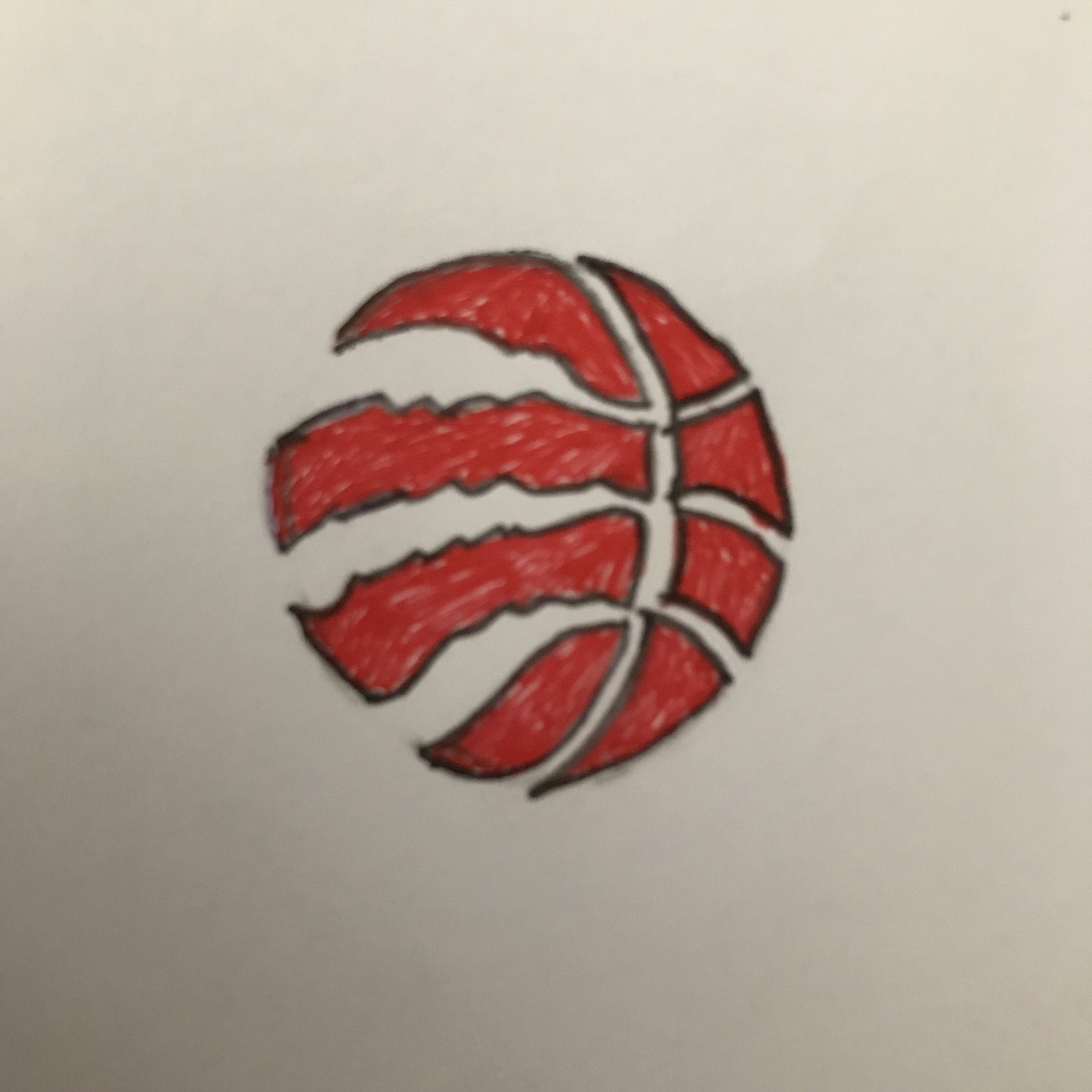
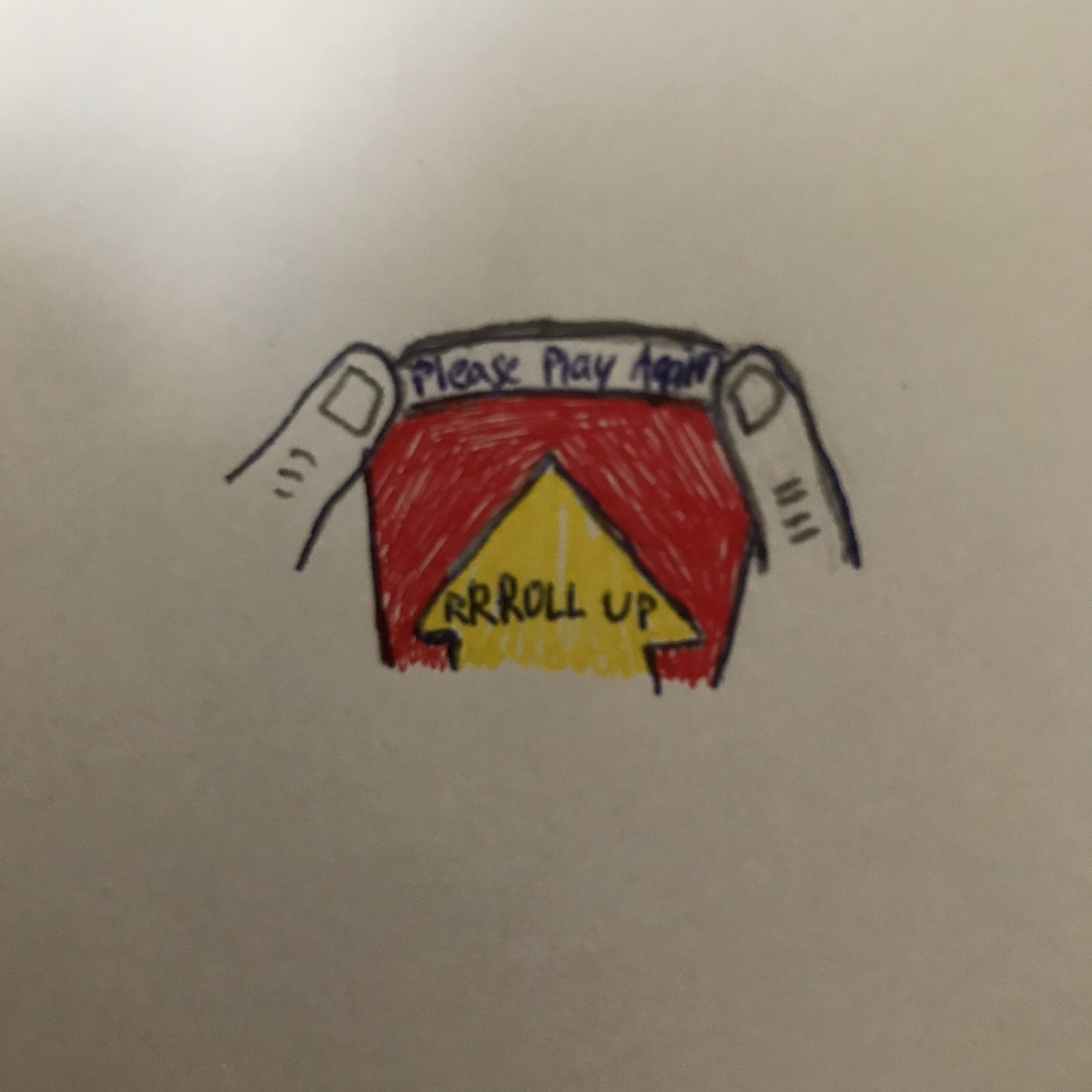
When I first started brainstorming for emoji ideas that would represent home (Toronto, Canada), I was initially a bit stuck. Some of the immediate things that came to mind were a bit stereotypical, and too generic – shovelling snow in the driveway, waiting for the notoriously unreliable TTC (public transit). After some thought, and wanting to make the emojis specific but recognizable, I decided to go with a Raptors basketball emoji, a poutine emoji, and a coffee cup (Roll up the rim) emoji.

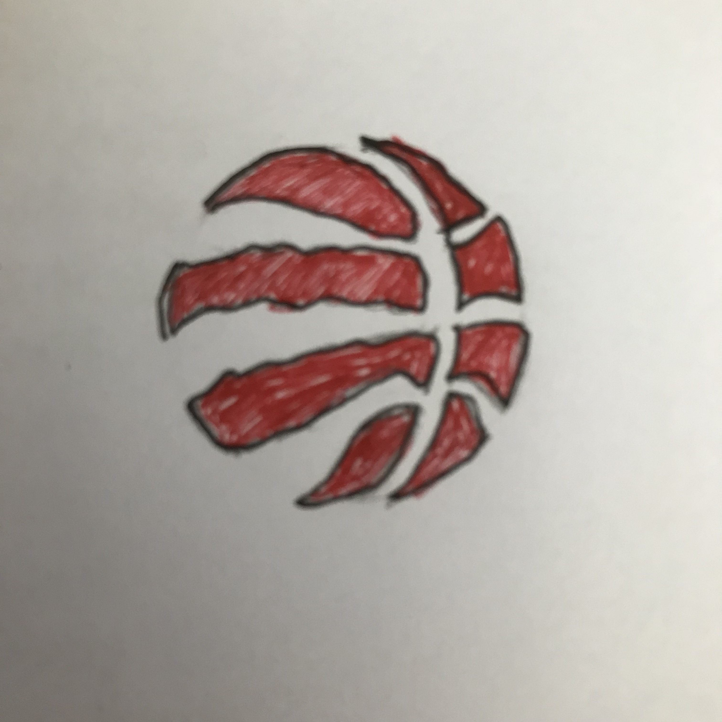
Toronto is a city that loves its sports teams. Although hockey is a typical Canadian favourite, Torontonians also love basketball, as we have a huge fan base for our home team, the Toronto Raptors. When there are games at home (which are often sold out), crowds will gather in an outdoor square dubbed “Jurassic Park” to cheer on the Raptors. So I decided to draw a basketball with the Raptors claw. (Although I am borrowing a bit from one of their logos…)

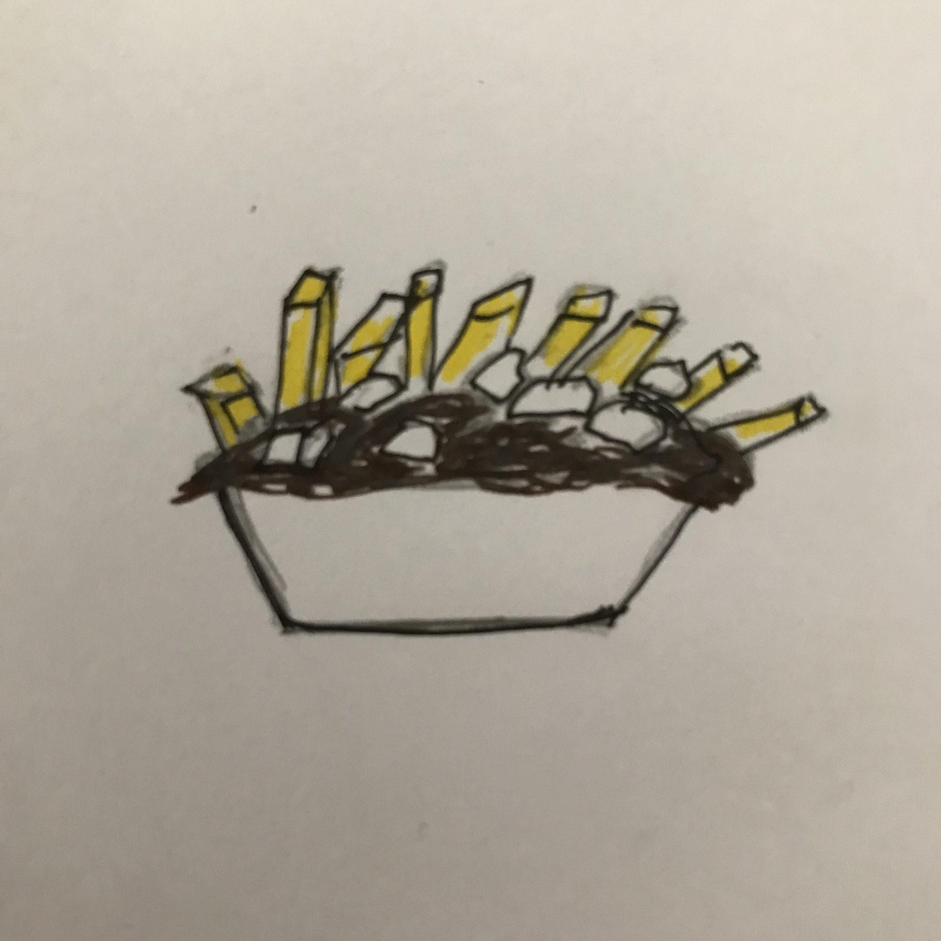
Poutine is a classic Canadian “dish” composed of fries, cheese curds and gravy. Though not strictly Torontonian, this emoji captures a bit more of the wider Canadian food culture.

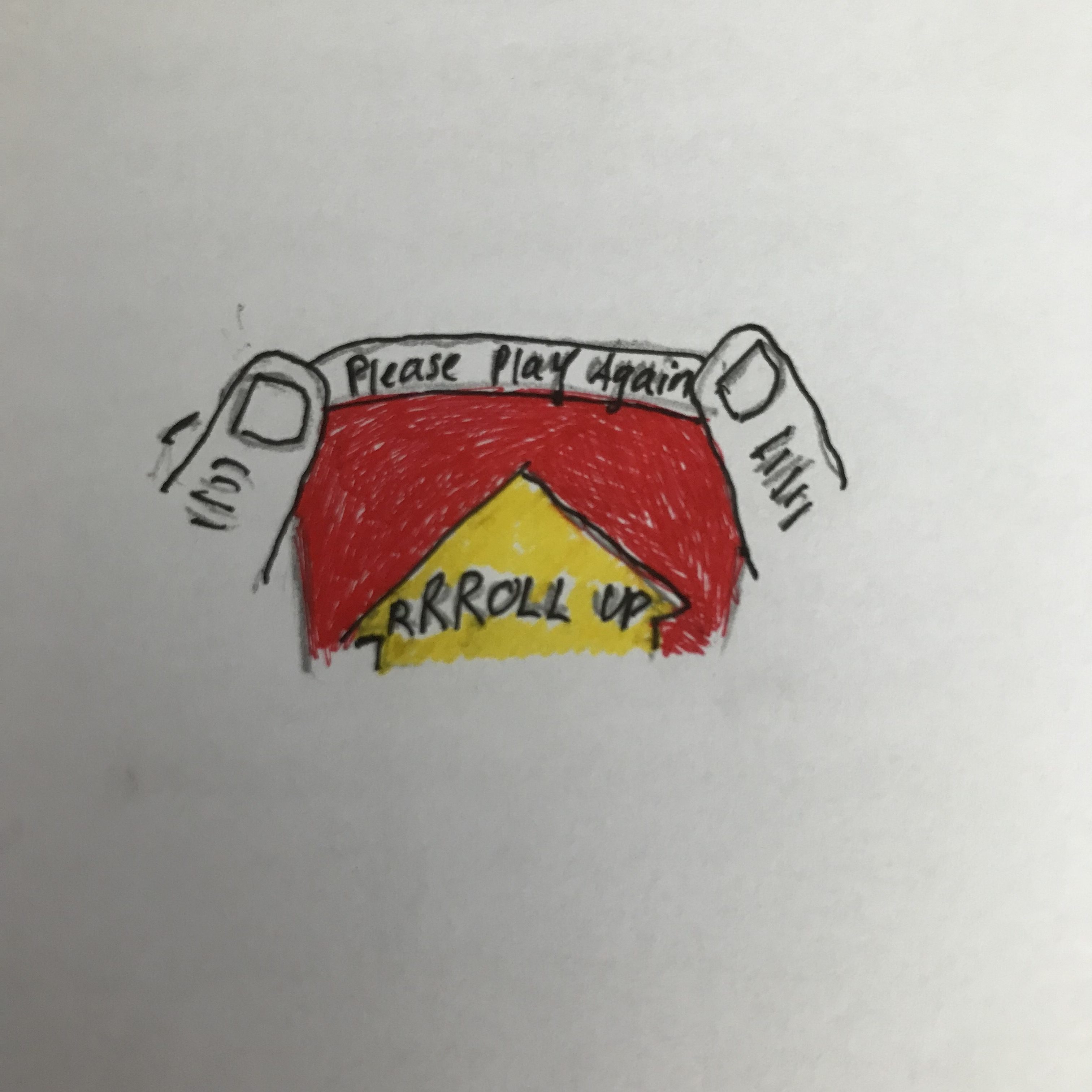
Given the busy city life and cold weather, locals also love coffee/hot drinks, especially Tim Hortons (which we call Timmies). I didn’t want to draw their  coffee cup exactly, since that would be using their brandname, so I decided to draw a popular aspect of Timmies: their Roll Up the Rim cups – a promo campaign where consumers can win food prizes in the rims of their cups. But more often than not, we unroll the rims to find “please play again” inscribed there.

I sent these emojis to two high school friends, explaining to both of them that I had to create 3 conceptual emojis that describe home. I asked them what they thought, and how the emojis made them feel. Both of them initially responded with a similarly amused and intrigued question: “what classes are you taking now? LOL”. After the initial surprise, they were both able to recognize what each emoji represented. My friend Daniella suggested the basketball could be made a bit more accurate, whereas the other two seemed fine. My friend Selina excitedly replied “Roll up the rim! You could even make it into a meme. Not the other two. But great ideas!” They both enjoyed the three emojis.

Given their limited feedback, I didn’t change much to the emojis except to clean up the designs a bit. I then sent them to my mom and sister, without an explanation. “Poutine!!! Can you buy me some?” was my sister’s response – it’s one of her favourite foods, and she’ll often make me buy her one when I’m home. My mom liked the emojis as well, although she didn’t recognize what the basketball stood for – she thought it was just a normal basketball. I realized that the Roll Up the Rim emoji might be a bit hard to see, since it has words on it – but the colours and overall concept was recognizable. Overall, I learned how tricky and fun it can be to design emojis, to capture aspects of “home” in a codified illustration.

Jordanian Emojis

For my emojis, I decided to experiment with three different categories (food, face, and building) all relating to Jordan. Listening to the 99% Invisible Podcast gave me some insight on how to approach this process. Initially, I was going to illustrate niche topics and Jordanian inside jokes, but I realized the importance of universality in the creation of emojis, even if their themes belong to a specific culture. I do not expect everyone to know what the emojis represent, but I aimed to at least make them universal within the defined domain of Jordan, its surrounding areas, and to people who have heard a thing or two about the country.

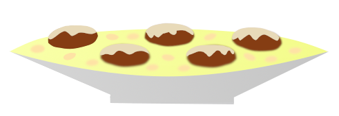
Mansaf ­­­– the national dish of Jordan. Everyone has seen it, and most people fall in love with it. The main ingredients include rice, lamb, and jameed (yogurt). This simple but delicious dish is served in special occasions and celebrations in large trays, allowing groups of people to stand around it and eat together (traditionally with their hands). For the emoji, I wanted to emphasize the tray, and give the ingredients their characteristic colors for ease of identification. Admittedly, my lack of talent made it difficult to make the emoji look as appetizing as its real-life counterpart, so I sprinkled almonds on the rice to make it more appealing.

Jordanian Man with Shmagh – a symbol of the country and its traditions. It was vital to get the red and white pattern right, as well as the top piece (‘gal).
I tried to make it look as close to the current set of face emojis as possible, for consistency’s sake. I had a hard time deciding on one expression to represent the population, so I left the face with a blank look so that any expression can be added later. 

Petra – one of the wonders of the world. I decided to go for the most recognizable construction in Petra, the treasury. I tried to imitate the general positioning of its features (columns, walls, doors, etc) without sacrificing the simple emoji-like look. I also made sure to get as close a color scheme as possible to the real thing. Despite that, I found it difficult to create an easily recognizable treasury, and looking up icons on Google made it clear that a more stylized approach could fix that problem.

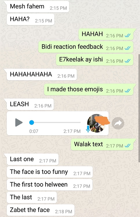
I sent the emojis to two friends with the caption “missing Jo” (which confused them), so I had to explain that this was part of a class and wanted feedback. Apart from some hesitation with the Petra one, they easily identified the emojis. I wasn’t sure whether the face emoji gave context that these things were Jordan-related, making them easier to identify. In retrospect, I should have sent the Mansaf/Petra emojis before the face to make sure that they’re separately identifiable. One friend mentioned that there’s too much going on in the Mansaf emoji. The other friend mentioned that the “face is too funny” and suggested that I should fix it. For version 2, I set out to add an expression to the face, simplify the Mansaf, and make the Treasury more easily recognizable.

For the second version responses, I sent the emojis without context to two different friends and asked them to identify what they represent. They easily identified all three emojis and mentioned that they generally liked them, but were more critical towards specifics that could be further improved in a third iteration. The most pressing change would be to the Mansaf emoji, since both friends mentioned the fact that the lamb looks like donuts.

As for the process itself, I used GIMP 2.10 to draw all emojis. I used path/selection tools to create general shapes, followed by fill/gradient/bordering/shrinking tools to add details. For color selection, I downloaded online images and used the Eyedropper tool to obtain the correct RGBs.

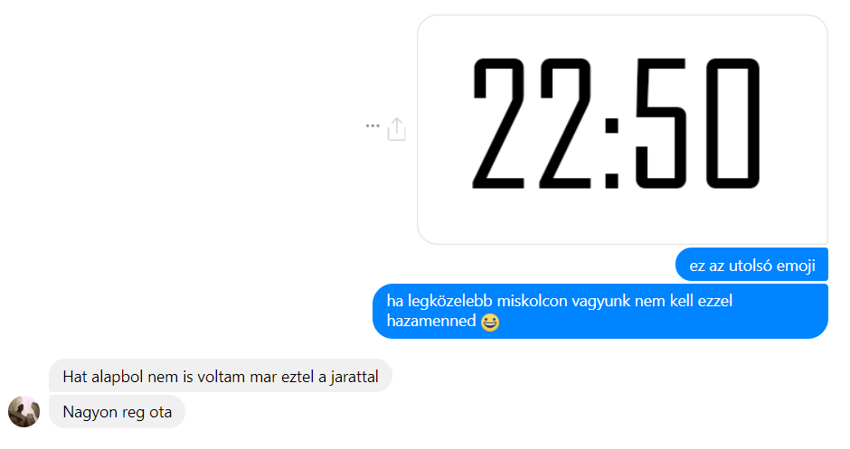
All in all, I learned how much goes into the process of coming up with proper illustrations to represent things in an identifiable way, specially with food and buildings. This was despite working on unambiguous things, as opposed to emojis that have vaguer/global applications. As a person who uses a grand total of 2 emojis (as seen in my chats below) and doesn’t really understand their overall appeal, I at least appreciate the intent of this method of communication now that I got to create a few of them.

Latvian/Raitis’s Emojis


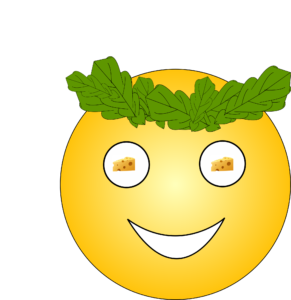
I interpreted the prompt in two ways. First, by “hometown” I understood my home country Latvia and I tried to create two emojis that would reflect the values important to it. Following this idea, I created the “LV 100” emoji that is dedicated for Latvia’s centennial which takes place this year. At the same time, I wanted to create an emoji that would share some of the Latvian values with others. For that reason I created the face emoji, which reflects the traditional Latvian summer solstice celebrations. Many interesting festivities take place during that time, but the ones reflected are the tradition of men wearing headbands made out of oak leaves as well as the fact that cheese is at the forefront of every meal during the solstice.

My other interpretation for “hometown” was something that only me and my closest friend group from home can relate to. I chose to create a pack of yogurt that we not only love, but also for some weird reason joke about a lot.

To create the emojis I considered drawing them by hand but realized that it would be difficult for me to edit them. On top of that, I feel like sharing emojis on paper is not common (or rather even a little weird). I used Inkscape which is a great open source tool. Only after having finished most of the emojis I realized that I also could have used the drawing screens in the library, which would have been an interesting experience.

I sent my emojis to the two friends from the friend group that I referred to before only saying that I require their feedback for a class assignment. First they evaluated the face emoji. They said that the face was too yellow, which to me was a little surprising because I had obtained the RGB values for the face from Google’s face emojis. He probably said that because messenger (which is the platform I used to communicate with them) does use a little darker emojis and is probably the most used platform for emoji communication. Learning from messenger emojis I also introduced a color gradient to the face. Asides that, my friends were the ones who came up with the cheese idea.

When evaluating the “LV100” and the yogurt emoji my friends raised a problem of how specific these emojis are. That is, “LV100” could only be used this year and the yogurt emoji by default is only understandable to us. I took this criticism into account and changed the “LV100” emoji to just “LV”. As the yogurt emoji was meant to be an inside joke, I did not follow up on that criticism. However, my friends also pointed out that it is a little difficult to understand that the emoji is reflecting a yogurt pack, which is fair because I found it difficult to draw it. In my initial version I had not included a cap from which one could drink the yogurt, therefore I added that after the conversations with my friends.

Emoji design for my hometown: Miskolc

Adam

In this assignment I was designing emojis for my hometown. During my process I considered many things that I considered something that people would recognize. I was using the framework that Aphee Messer was using as a reference for creating lasting emojis. It has to be something that a lot of people do, for example hashtags are a good way of getting inspiration. Well, in my case I a quick run down on the hashtags that appeared on Instagram in relation to my hometown (Miskolc) did not give me a clear image on what would be a marketable and well recognized emoji. Therefore I turned to my own personal experience – what is something that my friends and family or people in the area would give a special meaning to?

This is how I developed my three emojis:

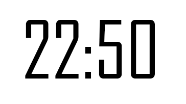
22:50

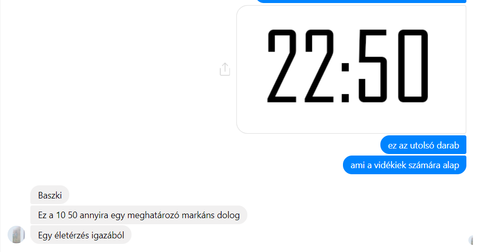
22:50 might not communicate anything to someone who is not from the area or does not live in the surrounding towns and villages of Miskolc other than the time in 2400 format. But for my friends who I used to go out with during the weekend, 22:50 is the time when the fun stops. This is because the last regional bus to the towns surrounding Miskolc depart at 10:50 pm and therefore the people who live there and intend to go out have to plan around this time if they are taking the bus. 

As I expected, my friends responded to it immediately. They got the message and the context that the time signified. They did not just see a time, they saw that I was asking them whether they want to go out with me — even though that now they would probably not use the regional bus. I also sent it to a friend who lives in the city, but he recognized the meaning as well. Adding to it, he became nostalgic and told me that 22:50 is not just a simple bus, it’s a way of life. He reminisced about the days in high school when 22:50 was sort of marker that our group always had to plan around, relying on buses that would mark the end of concerts or gatherings.

Lángos

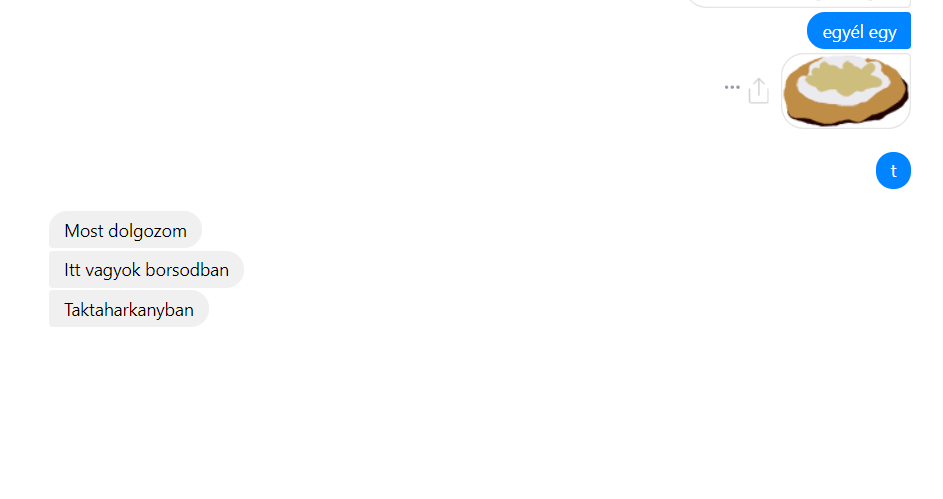
Lángos was my second choice, which is a type of street food in Hungary. I is very recognizable and unique for the country but not the region. You can buy it in small carts all around the country, but it is mainly a dish that people eat on vacation or in the summer. 

The base is a dough that is deep fried, and it is best when it is light enough so it doesn’t soak with oil by the time it is served. We put a garlic spread on top of the dough, then sour cream and we sprinkle cheese on it as a final touch. 

Since it is a popular food, I expected my friends to recognize it, and more or less my expectations were met. However they were confused why I would just send them a picture of a (badly) drawn lángos, and on one occasion my friend responded in a very confused manner, not knowing what it was. 

Buying feathers

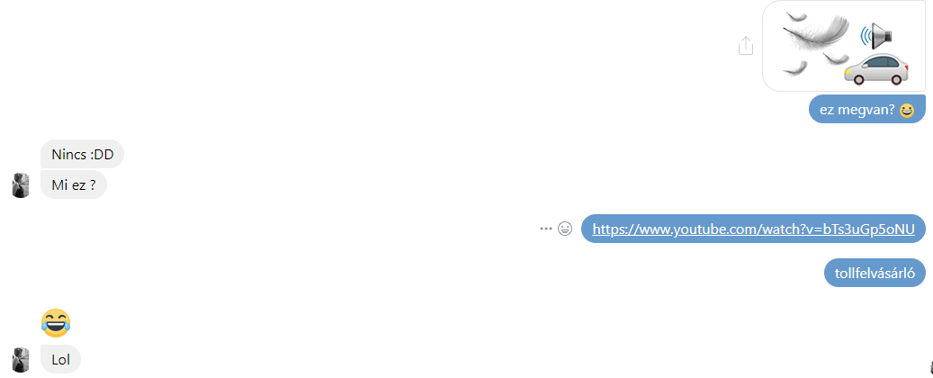
And this brings me to my final emoji: the feather buyer car. The feather buyer car is a very specific phenomenon that appeared a few times in our neighborhood and all over the country. It is basically a business I thought many people knew about because of the specialized marketing technique that they are using. The marketing involves a car that similar to an ice-cream truck circles the neighborhood with a slow speed, playing a recording on a loop. Instead of a jingle, they are using a very distinct voice that describes the strange business that the owners are operating. They are buying feathers from old fashioned pillowcases and duvets. 

The recording

Why did I choose this very phenomenon? Because I think it is very distinct and absurd enough that my friends would remember it. I stand corrected. It is either my emoji that was linked weakly to this phenomenon, or the feather buyer car itself, but none of my friends were able to identify the emoji. After I explained my sister sent me “:DDD” which I interpreted as a sign that at least she knows what I was referring to. I am clearly friends with the wrong people, because once I made a YouTube search, many parodies came up featuring the feather buying car and its message.

This brings up the question: can I improve this emoji? I don’t think I can do too much to redeem it since the idea behind it is not very well recognized.