Design and Process
We decided to design a semaphore system that uses colors and shapes to code the meaning of the communicated text. Our decision was based on the knowledge that human eye tends to react to colors and shapes very quickly, which is why the traffic signs, for example, rely on the color and shape system as well. There is a well-thought and well-tested methodology behind the traffic signs system, as each sign communicates a message to the drivers and pedestrians. A message is supposed to be as clear as possible and the receiver is expected to comprehend and react upon the message as soon as possible.
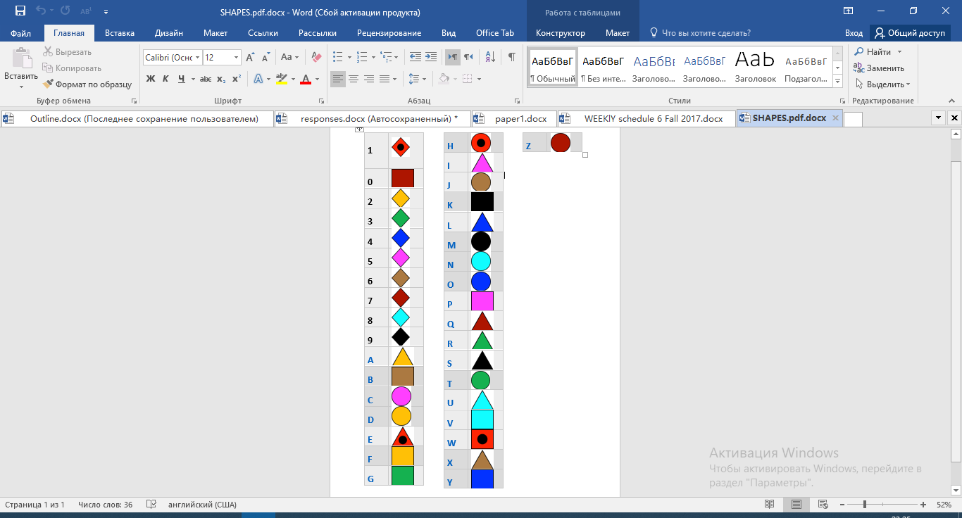
As speed and clarity of communication were some of the main parameters of the assignment, we decided to use the most clearly noticeable colors and shapes in our semaphore system. Firstly, we were trying to identify which colors are most easily distinguishable. For that reason, Theo consulted his colleague, Sarah Frampton, who is the Lead of Design and UX in NYUAD OSA department. She helped a number of colors and shapes that are most distinctly visible from a distance. So, having taken her advice into consideration, we decided to use 4 shapes (triangle, circle, square, and diamond) and 9 colors (red, yellow, green, blue, black, pink, brown, turquoise, dark red). Sarah also recommended using bold black borders to emphasize the shape and color, so we designed the shapes accordingly.
As we printed a few shapes out, we realized that dark red looked very similar to red. Thus, we added a black circle to the middle of each red shape, making sure it is clearly visible from the distance.
Then, we began to assign each symbol a letter. For that purpose, we researched the letter frequency in English alphabet. We wanted to use the most easily distinguishable shapes and colors with the letters that are used most often. So, for example, we assigned a yellow triangle to a letter E, which is the most frequent letter in English alphabet (it appears in 12.7% cases). Conversely, the least frequent x, q, and z were assigned to less distinguishable colors. Also, we decided to give all numbers the same shape of diamonds, as we saw this shape as potentially confusing given its similarity with triangle and square, and we assumed that there will not be a lot of numbers in the sentence.

Lastly, we assigned particular hand gestures to space, article “and”, “the”. Besides, we agreed on gestures that the receiver might need to use: one would mean “repeat the letter”, and another one “repeat the word”. We also decided that the sender should try to omit as many vowels as possible, assuming that a word can be easily comprehended without them.
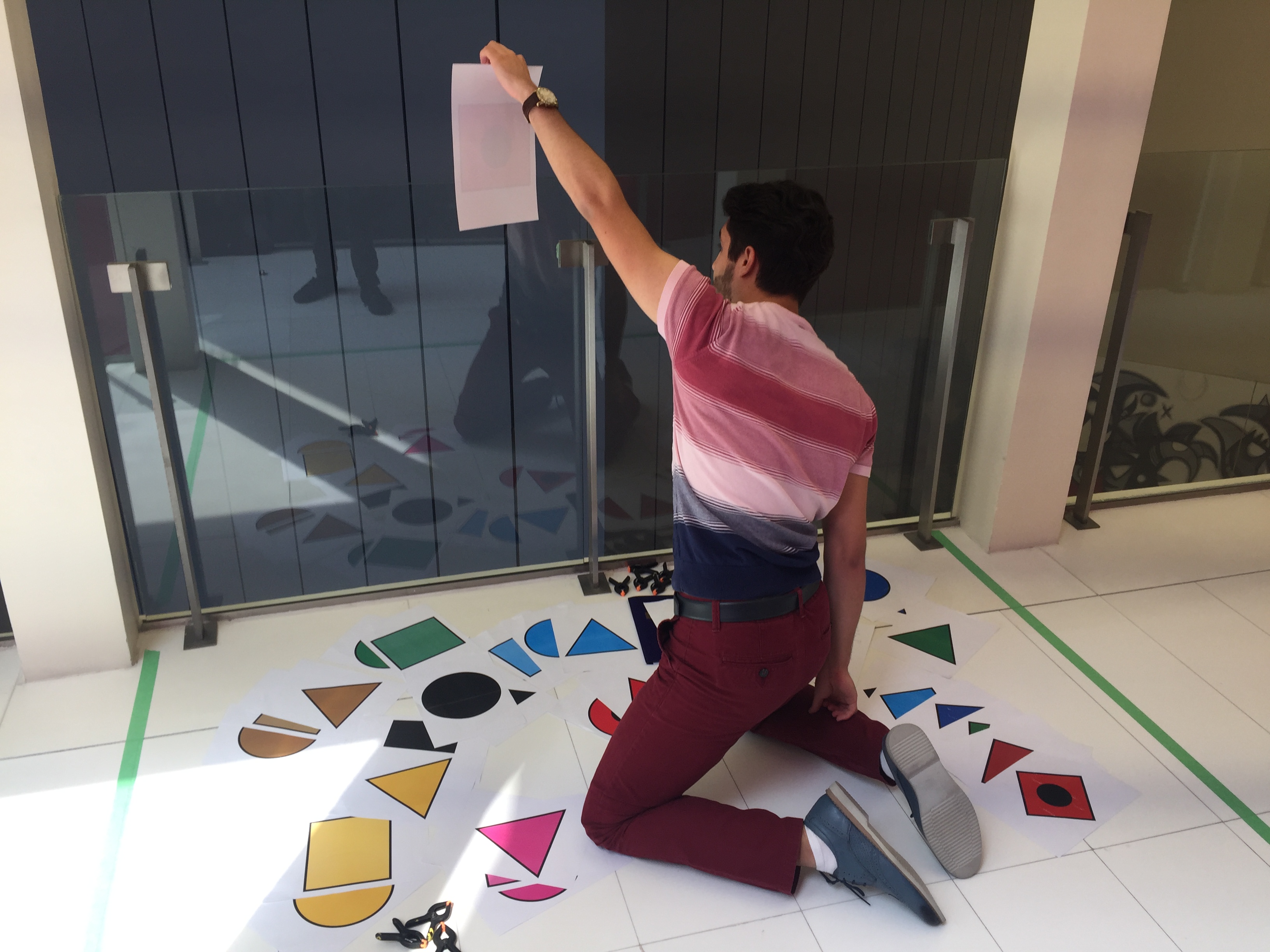
In regard to the process of sending the message itself, we first thought about attaching printed symbols to a cardboard. Then, we thought about using clippers and attaching papers to the glass. Lastly, we decided that the sender would just take one paper by one and then show it to the reciever.
Outcome
At the tournament we realized that our system had a few disadvantages. Firstly, communication was not fast enough (it took the sender 5 minutes to send the message). The reason for slow speed was the following: we had a separate paper for each symbol, and they were organized in different piles by color. So the process of searching for each symbol and then putting it back to the pile took longer than expected.
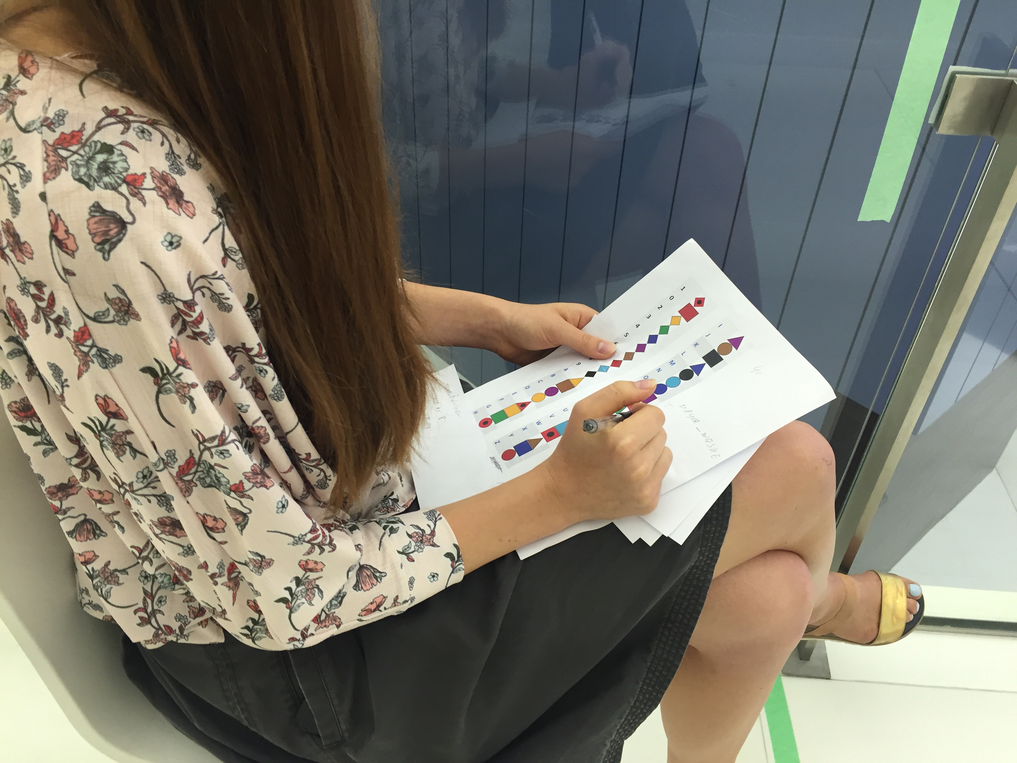
Secondly, the receiver could not always distinguish between the blue and turquoise colors, which led to confusion with some of the letters. Thus, one word in the sentence was not received correctly, which jeopardized the clarity of the message. However, omitting of vowels did work fine, as the receiver could comprehend the word “anniversary” sent as “annvrsry”. Thus, the overall meaning of the sentence was clear, despite the second letter being understood incorrectly.


Perhaps, if we could improve our system, we would think of a more efficient way to send a message – something that does not require every symbol to be on a separate paper, but can rather allow multiple symbols to be communited with the use of few objects.